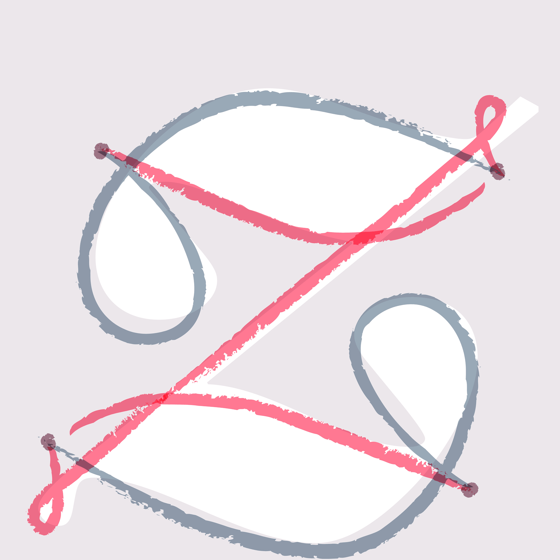
Sans Serif Symbols
In each of its ten weights, our Decimal family includes a set of 111 symbols for both annotating and illustrating text.
In each of its ten weights, our Decimal family includes a set of 111 symbols for both annotating and illustrating text.

The screen-optimized Operator Mono ScreenSmart is designed for developers, to make code both easier to parse and more satisfying to write.

Why 26-letter “pangrams” make every typeface look dreadful — and how to explore new fonts instead.
A typeface for beauty, wellness, and galactic conquest.
Often the most expressive part of a type family, italics come in countless different species. Meet the Superitalic, the Cursive Slab, and twelve more.
Is any typeface more in-the-know than a Slab Serif? Our newly expanded Sentinel family includes twelve weights, small caps, and two sets of ornaments.
Every designer has admired the no-nonsense lettering of the urban world. Its letters of paint, plaster, neon, and steel inspired Gotham, a typeface for the ages.
A distinctive and companionable typeface, Idlewild can be approachable, earnest, bright, or cultivated, but always at home wherever it goes.
A family of stylish condensed typefaces, Peristyle is designed to restore the effortless chic of the high-contrast sans.
Meet Chronicle Hairline, a set of typefaces born of the fashion editorial, designed for all kinds of dramatic visual storytelling.
Decimal has wide proportions that make it especially clear at small sizes, and includes a collection of symbols in each of the font’s ten weights.
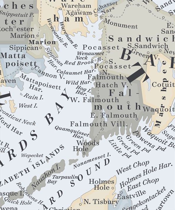
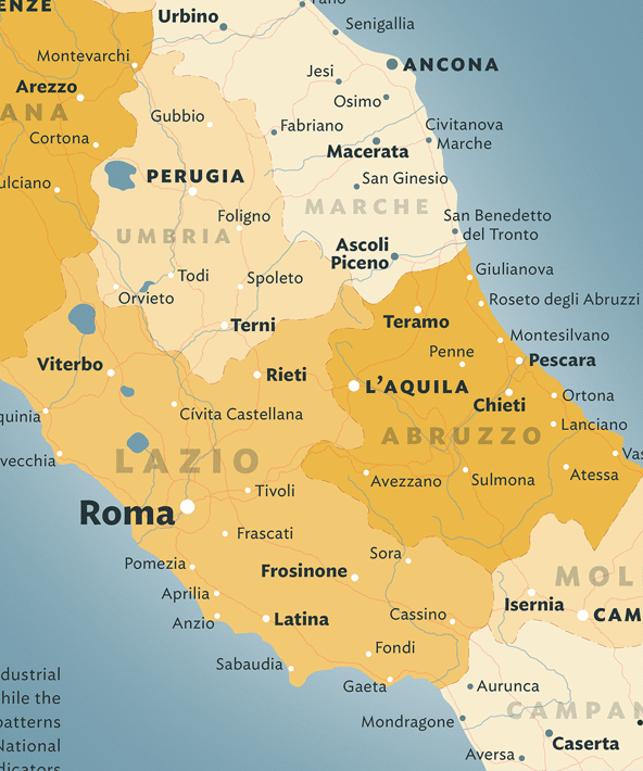
Surveyor is a large family of typefaces modeled on the unique style of lettering from nineteenth century engraved maps.
The compact Gotham Narrow is space efficient, with a tall lowercase that helps legibility at small sizes, and three related widths that can help articulate different kinds of information.
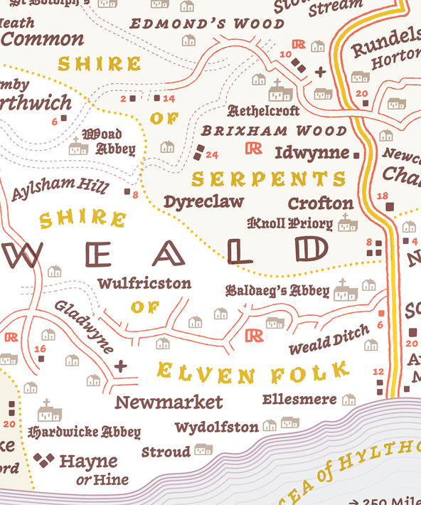
The Inkwell superfamily was designed for personal, informal, or fantastical maps, from wedding directions to the sprawling realms of fantasy worlds.
Operator uses different strategies to make easily-confused characters more distinguishable, and has compact descenders that make it easier to stack type.
Originally created for the screen, the personable Ideal Sans SSm not only thrives in web and mobile environments, but at small sizes in any medium.
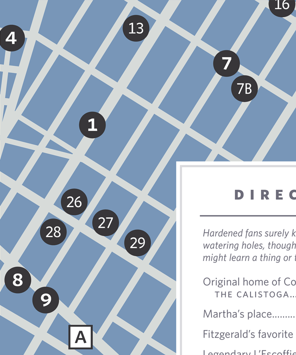
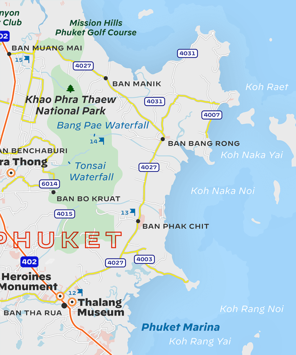
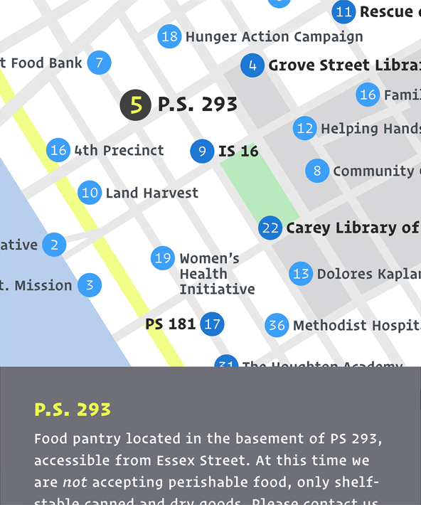
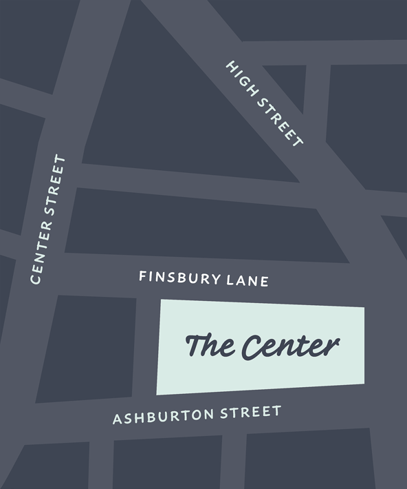
The Whitney family has the clarity and economy that recommends it to small sizes, along with sixteen sets of pre-built ‘indices’ for marking out locations on maps.
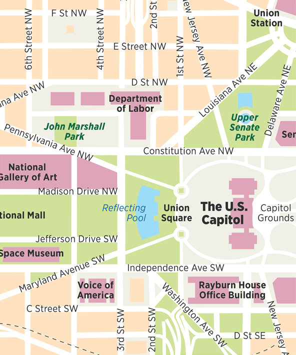
Eight weights across six widths makes Ringside one of our largest families, with styles that fit diagrams of any proportion.
The informal Inkwell superfamily has an unexpected breadth, including not only serifs and sans serifs but a script, a blackletter, and more.