
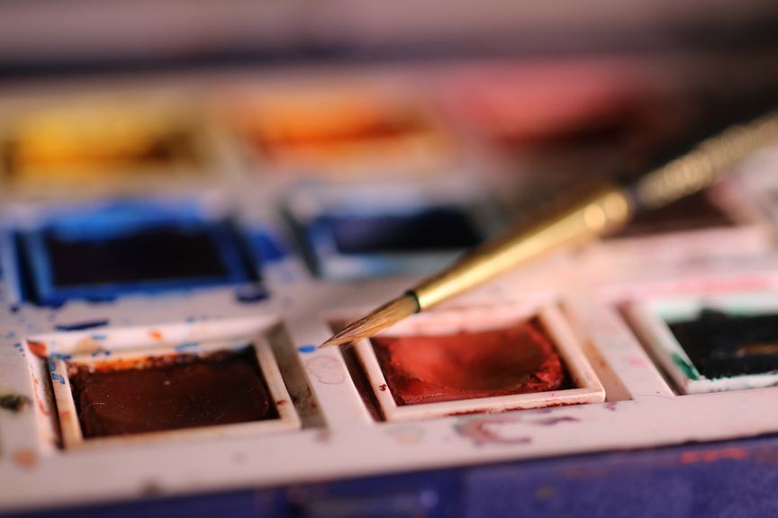
Preview
Resources
- Portrait by Lillian Bertram (Creative Commons Share Alike – used here with permission)
Step 1: Set up your Illustrator document
Start with a print document of 8.5 x 11″. Make sure to change the color space to RGB. 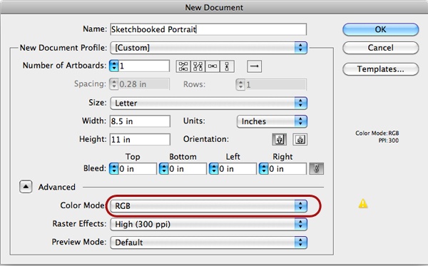
Step 2: Import the reference photo
Import the photo you will be using as a reference (File > Place).
In this tutorial, I used this portrait by Lillian Bertram. 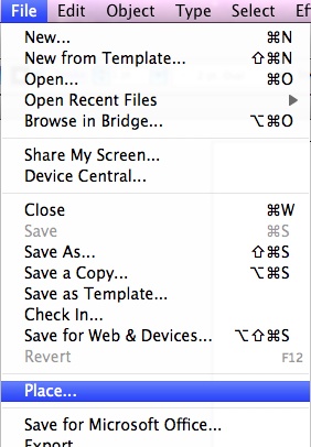 Size it up or down as necessary—try to size it up to the artboard. Don’t sweat the resolution or pixelation of the image since the reference photo is only a guide.
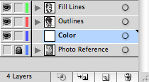
However, the better the quality of the image, the more detail you have to work from. Since the artwork will be imported into the first layer, name it “Photo Reference” using the Layers panel. Your work area should look like this: 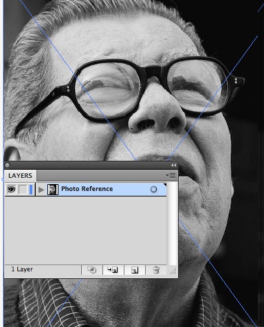
Step 3: Set up your work area
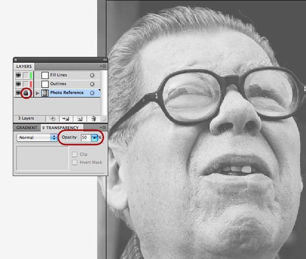
You are going to want to go to the Layers panel and create two more layers.
Name them “Outlines” and “Fill Lines“. Go ahead and select the reference photo on your canvas. With the photo selected, go to the Transparency panel (Window > Transparency) and lower the transparency of the photo between 50% and 70%—just enough for you to still see the features, but not enough to obstruct your tracing workflow. Now go over to the Layers panel and lock the reference photo layer so that you don’t accidentally move it.
 It may also help to select a Workspace preset for Painting (Window > Workspace > Painting) to set up an initial workspace and panels placement that’s suitable for what you will be doing.
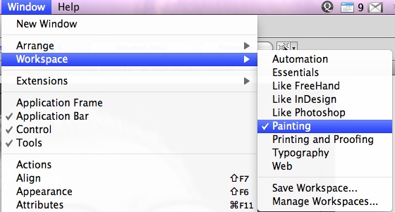
Step 4: Setting up your brush
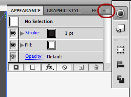
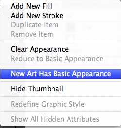
Before you get started, go to the Appearance panel (Window > Appearance) to show the Appearance panel. Click on the settings (upper left) and in the drop down menu that comes up, be sure that New Art Has basic Appearance is deselected.
 Then, you can close out the Appearance panel. Now double-click on the Paintbrush Tool (B) in the toolbar to pull up the options dialog box for the brush. Be sure to have Keep Selected and Edit Selected Paths unchecked as they can inhibit a natural drawing process.
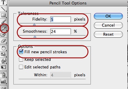
Adjust your Smoothness to a lower number if you have confidence in your drawing strokes, or a higher number if you feel you have a shaky hand or want straighter and smoother lines. I usually keep the Fidelity option around a 4 or 5 as well. 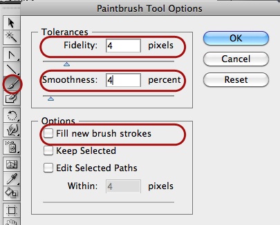 Go to the Brushes panel, select a 1pt stroke, and double-click the 2 pt.
Oval default brush. (If you wish, you may rename the brush to make it your own.) 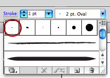 You can adjust the options so as to respond to the pressure and tilt of your tablet, as well as make it more of a flat-tipped, calligraphy style marker.
 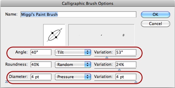 If you don’t have a tablet—don’t worry—you can still make adjustments to the head of the brush and add some randomness to the variability in the stroke.
These adjustments will make for a more realistic marker look. Be sure to doodle a bit on a blank area of your canvas on the “Outlines” layer until your brush looks as you wish. 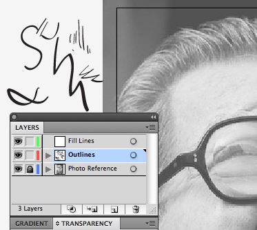
Step 5: Initial tracing
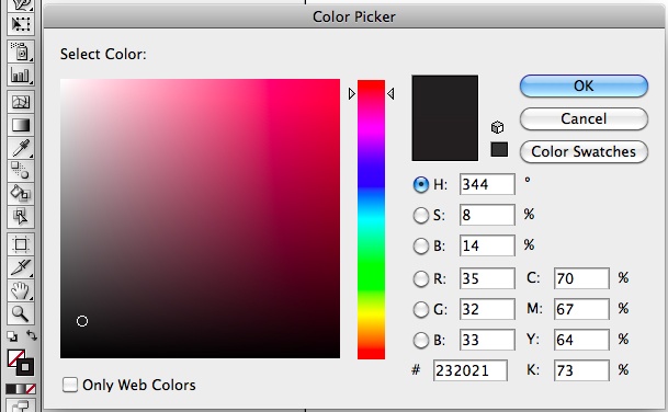
With the Paintbrush Tool (B) selected, go to the color selection area of the toolbar.
Make sure that there is no fill on the brush and choose black that has a little gray to it for the stroke—you don’t want to use a 100% black if you want a more natural look. 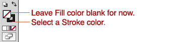
 Zoom in on the area of the canvas where you want to begin working. Personally, I like to work from the eyes outwards, but also find it just as helpful to work with a quick outline around the whole face and work inwards.
What you want to do is use short brush spurts of lines in a similar direction. You want to define the darkest areas of the photo, or the areas with the most contrast. Use the pressure of the tablet for thicker areas of definition.
You will want to shade with cross-hatched or diagonal lines to denote areas that are midtones. 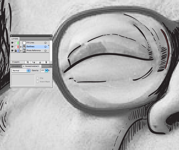 This is your chance to experiment and play around stylistically. You can change how your brush displays by going back to the Brushes panel and modifying the settings you created earlier.
You will have the ability to apply your changes to all your strokes, so long as you modify the same brush you used to make all of your previous marks. 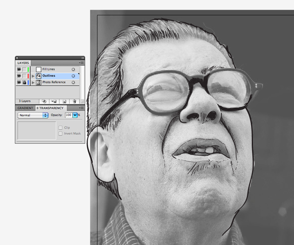 Periodically hide the “Photo Reference” layer to see how your composition stands on its own.
 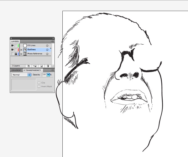 At some point, you want to break away from using the reference entirely once you have enough key features and focus on stylizing the portrait with your own marks and aesthetic.
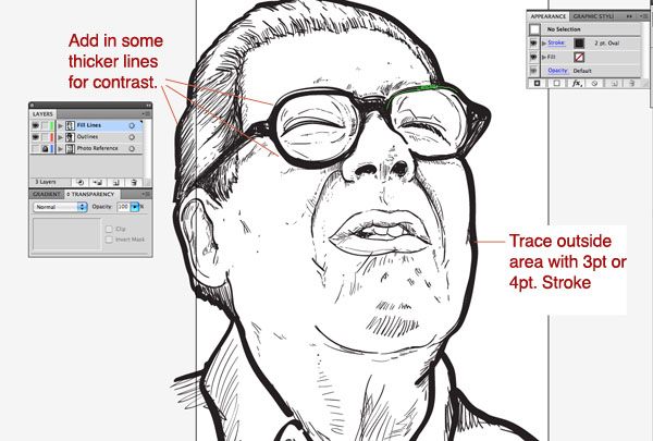
Step 6: Add contrast
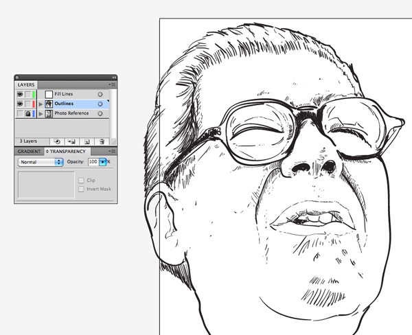
With your base outlines close to order, you will now add fill lines to the piece for greater contrast and to pull the piece together visually. Select the “Fill Lines” layer. Go to your Stroke panel and choose a stroke between 3pt and 4pt.
 You will now go over the outer edges and any areas where you want to make a bold distinction of contrast. This will also give it a more urban/graffiti/marker look.
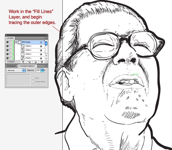
Step 7: Tweaking the piece
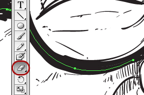
You can also make use of the Eraser Tool (Shift + E) to organically remove unwanted marks.
 Remember that all of your strokes are just paths so you can always pull and adjust curves using the Pen Tool (P) and Convert Anchor Point Tool (Shift + C) to make adjustments.
 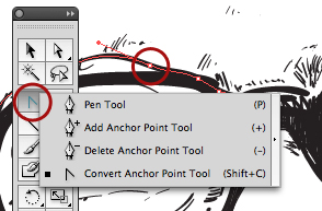 Also, you can use the Group Selection Tool (white arrow with a “plus” symbol) to select and edit areas of lines by scaling, moving or rotating as you see fit.
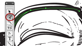
Step 8: Before you begin coloring
Since you want to achieve a softer and layered look with the colors, you will be using layered Pencil Tool (N) fills with a lowered transparency.
To begin, create a new layer to sit below your “Fill” and “Outline” layers. Name it “Color” and lock all other layers but this layer. Also, be sure to hide the “Photo Reference” layer.
Step 9: Set up the Pencil Tool
Double-click the Pencil tool Icon in the toolbar and adjust the settings as follows:
- Check Fill new pencil strokes
- Uncheck Keep Selected
- Uncheck Edit Selected Paths
 Go to the color selection area of the toolbar and swap the stroke color with the fill color so that there is no stroke color. Double-click the fill color and choose a skin tone color that is on the lighter end of a yellow to red hue. Next, go to Window > Transparency to select between a 15% to 20% opacity for your fills.
Test out your color and transparency by drawing some overlapping circles and see how the color fills build up. If the new fills aren’t showing up as transparent—or with the correct color—check your settings and also be sure that your Appearance panel has the New Art Has Basic Appearance option deselected. 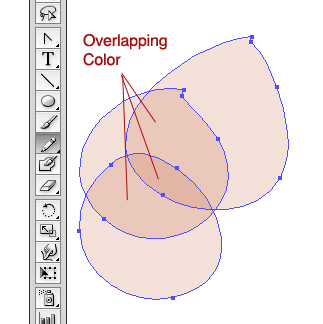
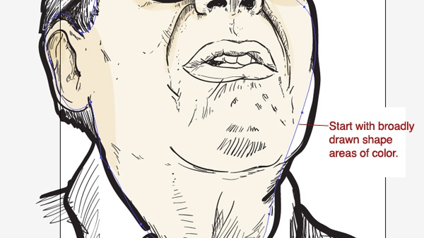
Step 10: Coloring in your portrait
Begin with the skin tones of the face.
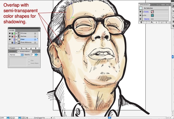
Draw overlapping shapes that contour and compliment your lines with the Pencil Tool (N). Over the darker and shaded areas, be sure to build up the color. Also select darker shades within the same hue to add more contrast and shadow.
 For the skin: I tend to work with yellows, oranges, and reds. Use a gradient for larger areas with a light to dark fade, and build on top of them. Be sure that your highlights are basically just areas with less color.
If you need to enhance highlights, draw transparent white shapes over these areas. Keep a light hand, and draw fast layered shapes with lower opacities—this helps keep the watercolor and layered feel to the illustration. Also draw a bit outside of the lines—with this process, imperfection is our friend.
 Since you will be drawing irregular shapes with the Pencil Tool (N), you may notice sharp edges and unclosed paths. To close paths, hold down the Option/Alt key right after you begin drawing your path and just before you finish it. This will complete any shape you are drawing.
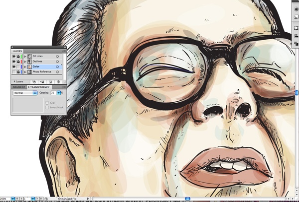
It’s okay to have irregular shapes and sharp edges; you can always edit them at any point with the Eraser Tool or the point-editing tools. Color in the rest of the portrait using colors that you find works best. It is a good idea to use the Eyedropper Tool (I) and choose a color palette from another photo you may find aesthetically-pleasing for user experience.
I also encourage the use of contrasting colors to add a bit of interest, like circle shapes of bluish hue shadows on yellow and orange areas of skin or small drops of deeper reds on blue or green tones. They add a bit of complexity and depth. 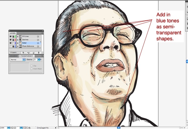
Step 11: Finalizing the portrait
At this point, you should be close to finished with the portrait.
Improvise, add flourishes, text, and deviate towards using your own technique and style to enhance your illustration. You may also bring your illustration into Adobe Photoshop for added effects, color management, and texture.
Conclusion
This tutorial shared with you some techniques for using Adobe Illustrator’s powerful set of painting and illustration tools.
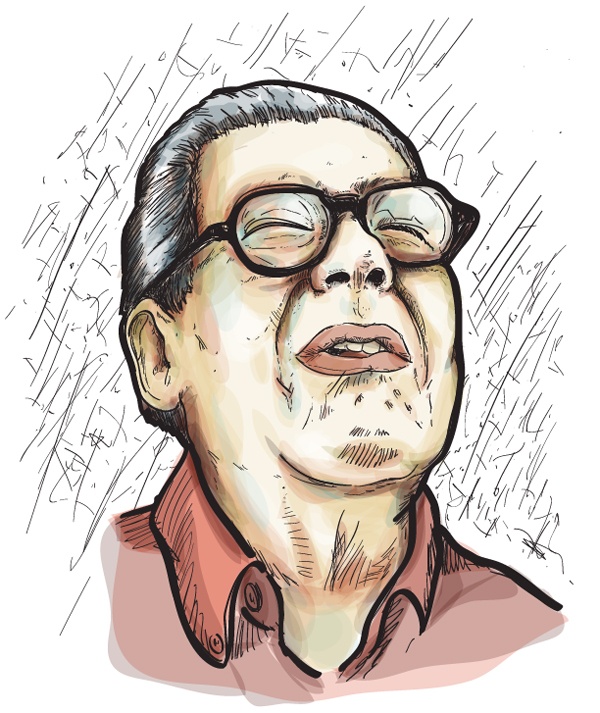
We also covered ways to set up your workspace to achieve the watercolor and marker style illustration. I hope you enjoyed my tutorial and have taken away something useful for web design by reading it. Here is the final piece.
Show us your work in the Flickr group pool.
Download Source Files
- watercolor_marker_portraits (ZIP, 1.6 MB)
-
 Trevin serves as the VP of Marketing at WebFX. He has worked on over 450 marketing campaigns and has been building websites for over 25 years. His work has been featured by Search Engine Land, USA Today, Fast Company and Inc.
 -

WebFX is a full-service marketing agency with 1,100+ client reviews and a 4.9-star rating on Clutch! Find out how our expert team and revenue-accelerating tech can drive results for you! Learn more
Make estimating web design costs easy
Website design costs can be tricky to nail down. Get an instant estimate for a custom web design with our free website design cost calculator!
Try Our Free Web Design Cost Calculator
Table of Contents
- Preview
- Resources
- Step 1: Set Up Your Illustrator Document
- Step 2: Import the Reference Photo
- Step 3: Set Up Your Work Area
- Step 4: Setting Up Your Brush
- Step 5: Initial Tracing
- Step 6: Add Contrast
- Step 7: Tweaking the Piece
- Step 8: Before You Begin Coloring
- Step 9: Set Up the Pencil Tool
- Step 10: Coloring in Your Portrait
- Step 11: Finalizing the Portrait
- Conclusion
- Download Source Files
Share this article


Web Design Calculator
Use our free tool to get a free, instant quote in under 60 seconds.
View Web Design CalculatorMake estimating web design costs easy
Website design costs can be tricky to nail down. Get an instant estimate for a custom web design with our free website design cost calculator!
Try Our Free Web Design Cost Calculator


