
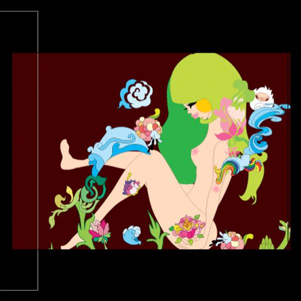
Preview
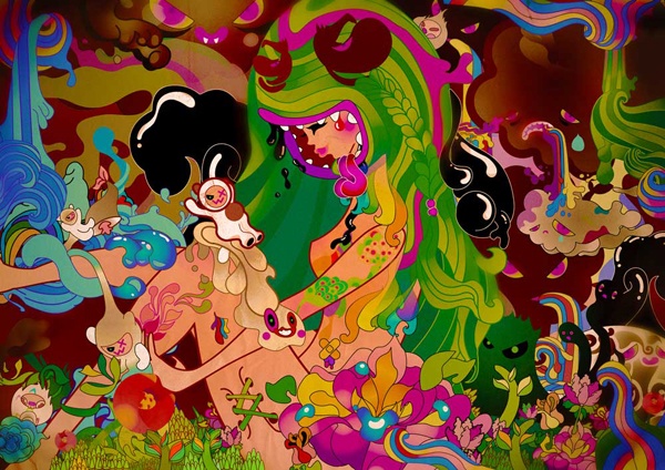
Introduction
Have you ever found it hard to start and finish a project? Maybe your thoughts are disorganized and vague or you aren’t feeling particularly productive, but you know deep down you want to create something beautiful.
All you need in this case is some inspiration, some Illustrator tips and tricks, and a little bit of Photoshop magic.
I’ll share with you how I start a piece with the help of my trusty sketchbooks, and then how I execute a project with Illustrator, where I create the elements of the illustration. And last but not least, I’ll go over how to finalize the artwork in Photoshop with some effects and image adjustments.
This tutorial is more of a walkthrough where I share general tips and tricks of starting and finishing an illustration project rather than a tutorial in making a particular illustration—let me say now that it’s not that kind of tutorial.
It’s also important to note that I’m using Adobe CS4, so some features that I discuss here may not be present to you if you have an older version.
Resources
- free textures by bashcorpo
Step 1: Look for inspiration
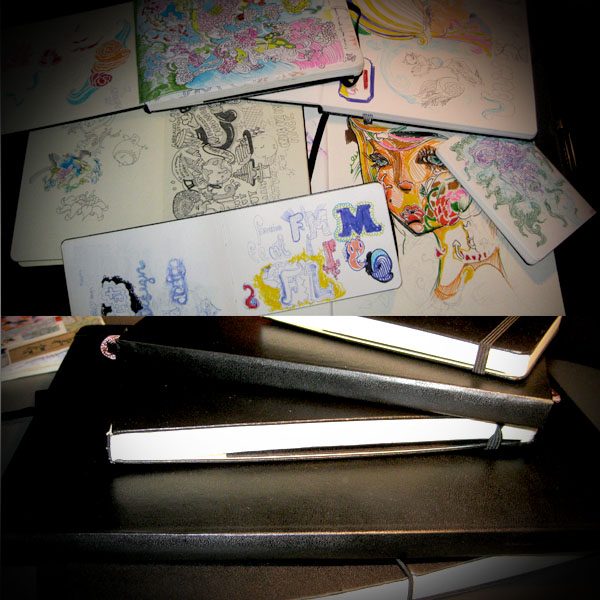
Yes, I know you may have heard a million times that as a creative you should keep a visual diary.
You’ve heard it a million times because it’s truly the best source of inspiration when starting a piece. Your visual diary is your primary source of inspiration because what you find in your sketchbook is a processed interpretation of what you have experienced or seen. What you discover in your sketchbook enables you to conjure up something original—conceptually or aesthetically—based on personal life events, experiences and emotions.
Step 2: Sketching time!
With sketchbooks open in front of you, import your interesting sketches via your preferred method—even taking photos of your sketches with your mobile phone’s built-in camera and uploading it onto your computer works.
Play your imported sketches as a slideshow and just start to sketch and develop a character, story and mood.
I prefer viewing my sketches as a slideshow because the images are constantly changing and, as you are sketching, you can occasionally look up at your screen and be inspired by whatever is currently previewed.
I know I have given a lot of emphasis on developing your own sketches, but don’t be afraid to stick in any inspirational images you have found into the slideshow.
A great place for inspirational images to check out (and one of my favorites) is FFFFOUND.
Below you can see that I start off by exploring different possible compositions through rough thumbnail sketches.
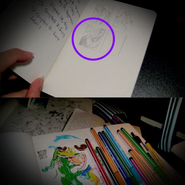
Once I know what kind of story I want to tell, I start to think of details and aesthetics. I rough it out on a new page and block out shapes with colored pens. Using color at this stage can be very inspirational.
So if you have access to color, use it.
Step 3: Make a template in Illustrator
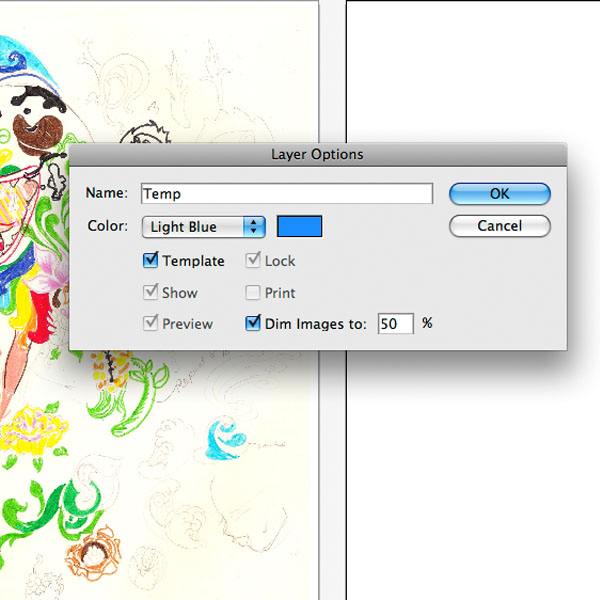
Once you are happy with your detailed sketch, scan it in at a very low resolution like 72 dpi.
Then place the sketch into your working document via File > Place.
Then, in the Layers Panel, double-click on the layer where the sketch is on and tick the Template box in the dialogue box that appears. In the same dialogue box, you can also specify a preferable dim value (how light the image will be for tracing); I use 50%.
Step 4: Use the Pen Tool for the base shapes in Outline Mode
Now create a new layer above the template and name it ‘Base Shapes‘. Before you start tracing the base shapes of the sketch with the Pen Tool, first convert this layer into Outline Mode by Cmd/Ctrl-clicking on the eyeball icon next to the layer’s name.
![]()
Outline Mode is very handy because it previews just the vector lines of what you are creating with no fill or stroke.
Step 5: Use two views and Smart Guides for convenience
When tracing with the Pen Tool, I make a new window preview of my working document because I have it in non-Outline Mode, zoomed out and with hidden edges.
On the other view of the document, I can have my artwork zoomed in with edges shown in Outline Mode.
Most importantly, you should toggle Smart Guides on when tracing (Cmd/Ctrl + U). Smart guides are a must because they give you annotations when hovering over a path or anchor point.
To set up your two views for your working document: Go to Window > New Window (this makes a duplicate view). Afterwards, go to Window > Arrange > Tile (this positions the two windows side by side).
Step 6: Trace all elements on separate and organized layers
When tracing elements, it’s a good habit to keep them grouped together and organized.
Keep elements in intuitively named layers to help you find them later on.
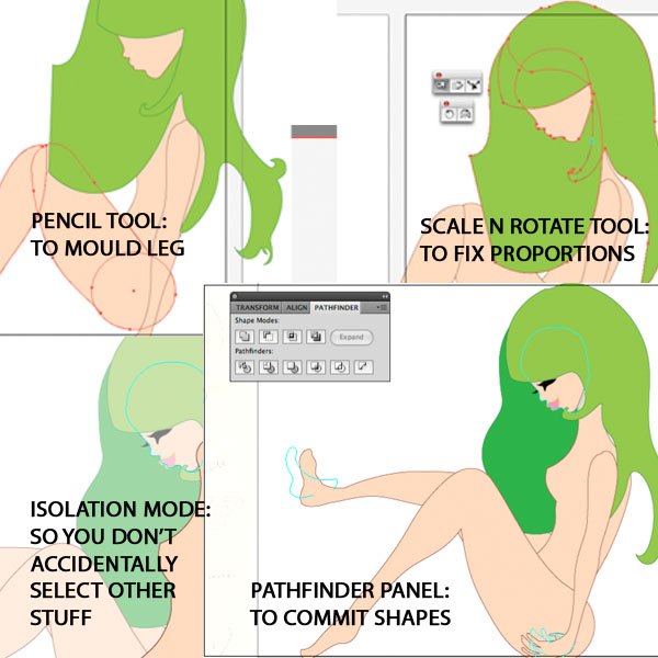
Step 7: Other useful tools besides the Pen Tool
After using the Pen Tool, you can further manipulate and reposition paths with the following tools:
The Pencil Tool (N): allows you to freely manipulate paths. All you have to do is click on the path with the Pencil Tool and draw freely; but make sure when you release, you are still on the same path. Also very handy is the hidden Smooth Tool that the Pencil Tool becomes when you press Opt/Alt while drawing.
Scale Tool (S) and Rotate Tool (R): in the example image below, using the Scale and Rotate Tool proves to be useful in rotating the character’s head and hair and adjusting her body’s proportions. However, the real power that lies in these tools is in being able to generate a pivot point, which is used as an anchor when applying transformations with these tools. Create a pivot point by clicking-and-releasing while using any of these transformation tools.
Isolation Mode: is a very handy feature that enables you to isolate individual paths or groups.
This ensures that you don’t select anything you don’t want to select. To enter isolation mode, just double-click on a single path or group.
Pathfinder Panel: is what enabled me to make the character’s buttocks, leg and foot into one path using the Combine command.
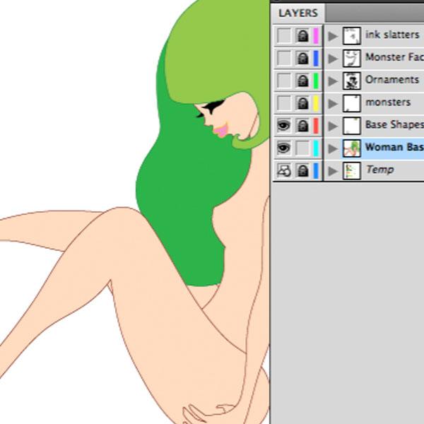
Step 8: Separate and organise
It’s time to revisit the Layers Panel again and create layers and groups, as well as to make sure everything is in order. The woman is given her own layer because she is no longer just ‘Base Shapes’.
I can’t emphasize this enough because I know when I get lazy and finish a piece and the layers aren’t organized, I never want to revisit it again. And you never know when you will need to revisit a piece.
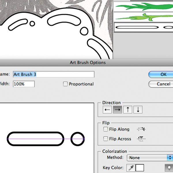
Step 9: Make ornaments into art brushes
You may want to make art brushes out of some elements you have traced with the Pen Tool. Art brushes are wonderful things; they allow you to utilize a graphic as a brush.
To make an ornament or any other element in your artboard into an art brush, just select it with the Selection Tool (V) and drag it into the Brushes Panel. When you do this, a pop up menu appears where you can select the New Art Brush option. You can fiddle around with the settings, but I generally just use the defaults, with the exception that the Proportional option is enabled.
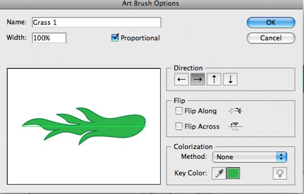
However, with art brushes in Outline Mode, all you will see is a single path made by the brush stroke.
To get the actual graphic’s fill and stroke, go to Object > Expand Appearance.
Step 10: Make pen-traced elements into filled paths
When tracing the template with the Pen Tool, I outline the shape of the element with a default white fill and black stroke. You can achieve this easily by selecting the closed path and then pressing D. Eliminate the white fill by pressing forward slash (/) while it is selected.
With just a black stroke, trace all the details of the element.
Afterwards, select all the paths of the element and convert it into a live paint group by pressing Opt/Alt + Cmd/Ctrl + X.
Go to Effect >Pathfinder > Divide. Use the Object > Expand Appearance command and then hit D on your keyboard.
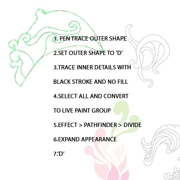
You have now prepared your elements for some easy coloring with the Eyedropper Tool (I).
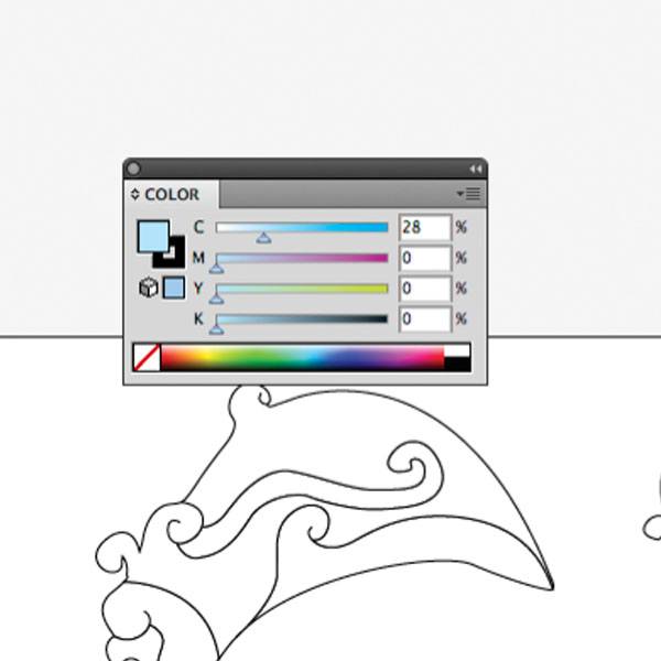
Step 11: Color in the paths quickly with the Eyedropper Tool
So now that you have made your traced elements into closed paths, it’s time for you to color them as desired. What I do is position the Color Panel close to the artwork I want to color.
Select the Eyedropper Tool (I) and sample the color you want the fill/stroke to be, from the Color Panel.
With the Eyedropper Tool (I), Opt/Alt + click on the path or fill and see how the eyedropper can be used similar to the Live Paint Bucket Tool.
This is a handy technique for rapidly and effortlessly coloring in your paths.
Step 12: Make a rough comp
Once you have all you elements colored and grouped, roughly compose them on your working artboard.
It is more flexible and fun to refine a composition this way because you can change proportions, duplicate elements, change colors and perform other illustration processes.
Step 13: Shaping the composition with a border
When rough comp’ing, I like framing the art piece inside a border.
I do this by first making a new layer as the topmost layer in the layer stack. I then use the Rectangle Tool (M) to create a rectangle with the same size and position of the working artboard.
I then cut (Cmd/Ctrl + X) the rectangle, create a larger rectangle, and then paste the first rectangle in front of it using Edit > Paste in Front (Cmd/Ctrl + F). Ensure that these two rectangles have a fill of black (#000000) and the stroke set to None.
Select both of the rectangles with the Selection Tool (V) and use the Subtract command in the Pathfinder Panel.
Step 14: Create depth with gradients
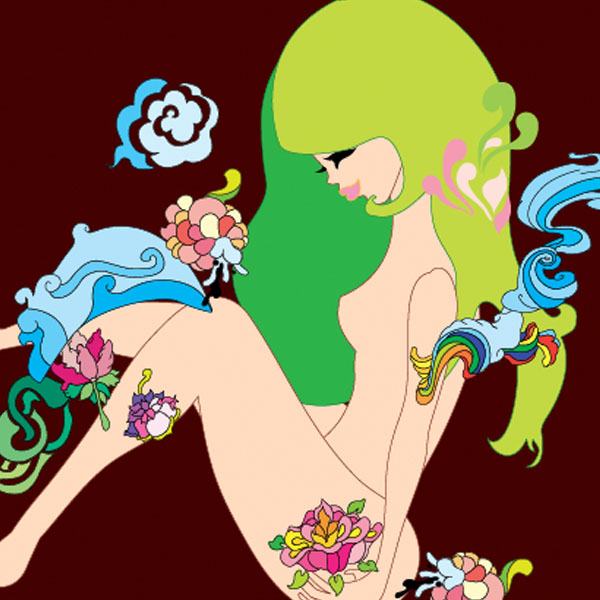
When making an illustration like the example, the details and a sense of depth are important.
Gradients are perfect for this because you can create shadows and give emphasis to foreground elements.
To make a custom gradient just experiment with the Gradient Panel.
Here are some handy and fundamental tips for the Gradient Panel:
Opt/Alt + dragging a color stop lets you duplicate it.
Fiddling around with the gradient sliders (they are grey and diamond-shaped) changes how two adjacent colors blend.
If you want a color stop to be the same color as something on the artboard, just select the color stop on the Gradient Panel and Shift-click on the color you want and the color stop will inherit that color.
Step 15: Make life easier with art brushes
Art brushes can be very handy for adding some quick and basic details to an art piece. As you’ll see in the image below, I’ve used art brushes to make the basic paths for some highlights on some black blobs of the artwork.
As you can observe, the highlights are a rounded rectangle and a circle. I then make an art brush, paint with it, and when I’m done, I expand the path’s appearance (Object > Expand Appearance). Once expanded, I manipulate the highlight paths with the Pencil and Smooth tools.
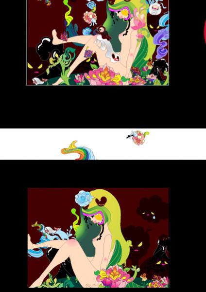
Step 16: Alternate composition with Artboards
At this point of the project, maybe you would like to experiment with other composition ideas.
But working out a piece’s composition from scratch can be quite an intensive process. So instead, I suggest making a duplicate of what you already have using the Artboard Tool (Shift + O) in the Tools Panel and experimenting with the copy.
To do this, first make sure that you will also be duplicating the artboard’s contents by checking that the Move/Copy Artwork with Artboard option (found in the Options bar of the Artboard Tool) is toggled on.
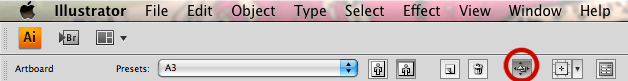
With the tool activated, hold down Opt/Alt and drag the selected area to duplicate the artboard and its content.
Step 17: Using the “printed template” technique to add to the piece
While working on an illustration, you may realize that you want to add more elements to it by sketching on it by hand. I’ll call this the “printed template” technique.
To do this, you’ll want to print out a dimmed template: Make a duplicated artboard with its art, select all the art in the artboard, and go to Object > Rasterize. Then to dim the template, lower the opacity of this rasterized image with the Transparency Panel.
Now you’re ready to print this image out as a template that you can doodle additional elements on. Note that in the Print dialogue box, you have to specify the Fit to Page option and the artboard number the template is on.
Step 18: Doodling on the template
Sometimes I find myself midway through a piece and feeling quite uninspired.
So this step is something I enjoy doing when I’m in this funk. It gets me excited and enables me to generate more ideas to make the piece better.
I start by roughly doodling things with a pencil, then finishing it off with a thick, black pen. I did this printed template technique twice with the creation of the piece used as an example in this tutorial.
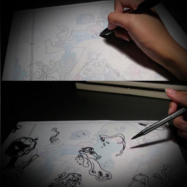
Once you finish your drawings, scan it back in, make a new artboard for it, place your scan into the new artboard (File > Place) and make it into a template.
All good for some pen tracin’!
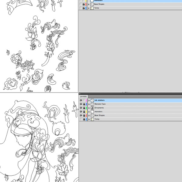
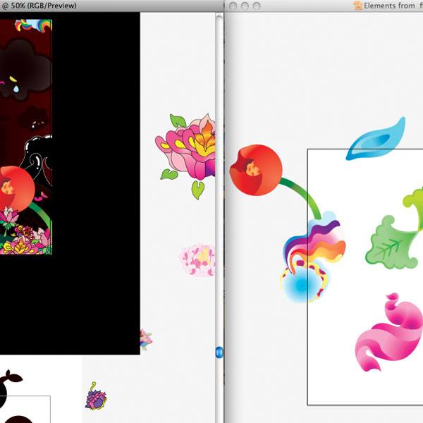
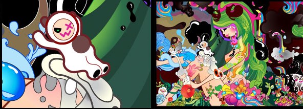
Step 19: Recycle elements with a library of assets
Another way to keep those creative juices flowing midway through a piece is by keeping a library of assets.
I have an Illustrator document (shown in the image below, on the right) where I experiment and add things to when I’m bored; it serves as my simple graphics library.
When working in this document, I usually go through my sketchbooks and find motifs I want to make digitally. Sometimes I take a photo of the sketches and use them as templates. Other times, I’ll just have a look at the sketch, improvise, and experiment in Illustrator.
With that said, this sort of document definitely has a practical use as it can serve as a library of motifs that can be copied from and pasted into your current project.
Below you can see that I took the red gradient flower (from the right) and used it in my new piece (on the left).
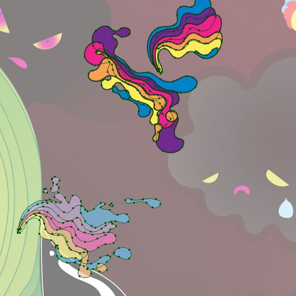
Step 20: Creating variation with Isolation Mode and Pencil Tool manipulations
Creating variation in a piece is a wonderful way of incorporating nice details to it. You can do this by taking advantage of Isolation Mode and Pencil Tool manipulations.
As shown below, the shapes are unified by their colors, but vary in their shape. And since they have been grouped together, they can be isolated without accidentally selecting anything else.
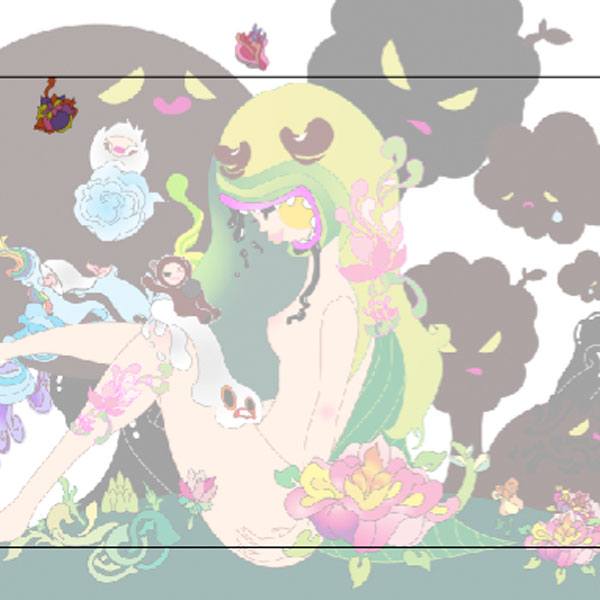
Step 21: Masking your art piece
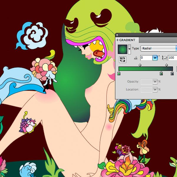
Masking in Illustrator is useful in creating the illusion of depth, as seen below with the tongue of the subject.
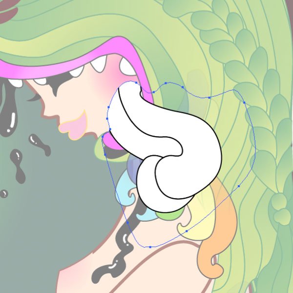
To mask something in Illustrator, you have to have the “maskee” (the elements to be masked) underneath the masker (a single path that has the shape for masking).
Then select both the maskee and masker and hit Cmd/Ctrl + 7 to create the mask.
However, if you want the masked shape to be committed (with actual fills and strokes) go to Effect > Pathfinder > Divide, and then Object >Expand Appearance.
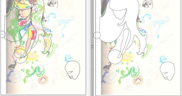
Step 22: Using two views for positioning the details
Details can make or break a piece. Therefore, it’s important to tweak them until you get them right.
You want to make sure they are in just the right position, so you want to zoom in close, but you also want to see how they fit in the whole composition, so you want to zoom out.
Zooming in and out can be tedious and unsynchronized; that’s where the “two views” technique comes in handy.
Below, you can see two views: one zoomed in close (left), and one that shows the entire composition (right).
Step 23: Photoshop time!
Once your piece is finished in Illustrator, it’s time to export it for Photoshop.
Go to File > Export and specify the artboard to be exported, as well as what format you want it to be. I generally export a high quality JPG with 300dpi just to be safe in case I want to use it for print purposes later on.
Open the exported document in Photoshop.
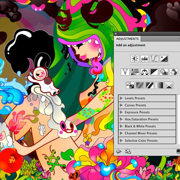
Step 24: Image adjustments
The first thing I do in Photoshop is to open the Adjustments Panel and try out the various adjustments available.
Experimenting with image adjustments can be very inspiring as it lets you explore various color schemes and moods. In particular, I like playing with levels, curves, selective color, and hue and saturation.
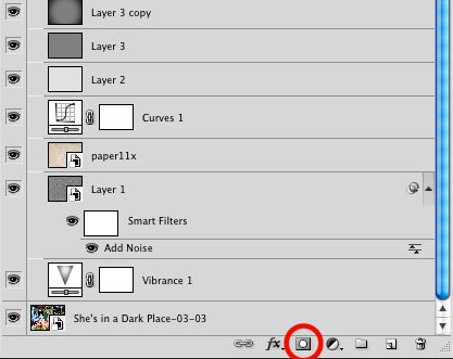
Step 25: Adding noise for texturing the art piece
Make a new layer in Photoshop (Shift + Cmd/Ctrl + N) and specify the settings below.
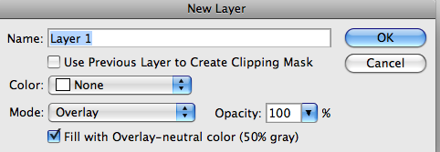
Then go to Filter > Noise > Add Noise.
The amount of noise you want to add is up to you. Now you have a layer of noise. You can soften the effect of the noise on underlying layers by adjusting the layer’s opacity.
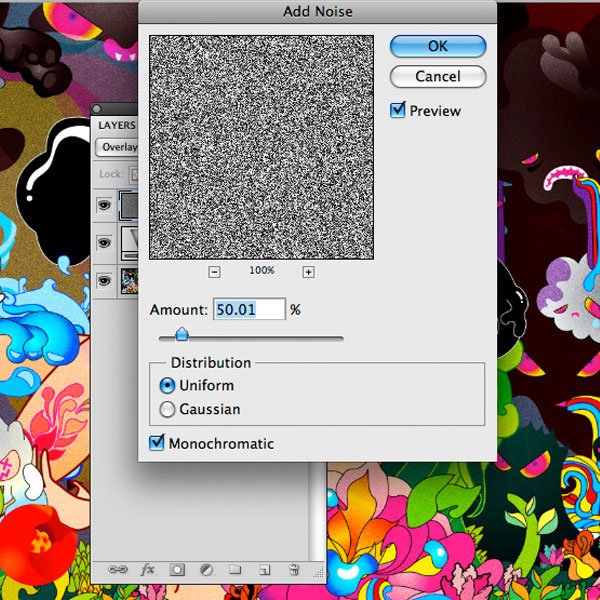
Step 26: Adding stock textures
For this piece, I placed a texture onto my composition and set its blending mode to Multiply.
Doing this gives the vector work a tactile feel. You can adjust the texture’s intensity by altering the texture layer’s opacity.
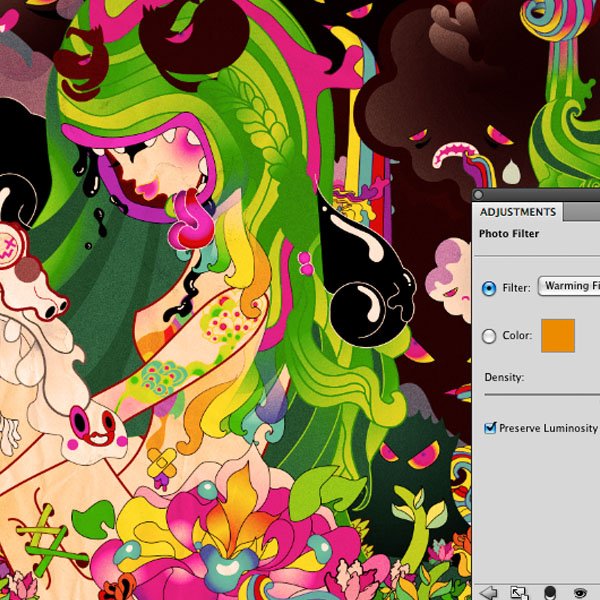
Step 27: Adding a Photo Filter adjustment
The Photo Filter is an image adjustment that has been instrumental in creating the overall mood of the art piece. It’s a very good way to tie a piece together and establish its general tone.
Step 28: Adding a blur mask
As a finishing touch, we’ll add a blur mask.
The first thing to do is to merge everything you have made. An easy way to do this is to choose a layer in the Layers Panel and press Shift + Cmd/Ctrl + Opt/Alt + E Shift-Cmd/Ctrl-Opt/Alt-E. Doing this merges everything in a separate layer at the top of the stacking order.
With the merged layer chosen, go to Filter > Blur > Gaussian Blur.
Specify an amount and make sure you can preview the amount by ticking the box beside the Preview option.
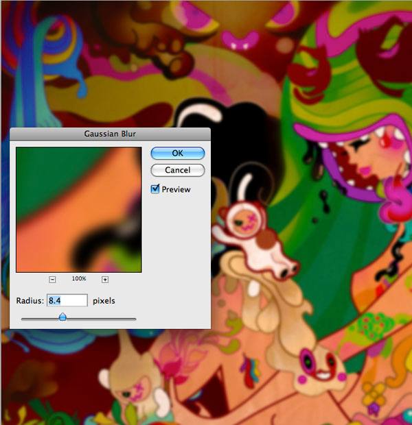
Then make a layer mask for this layer and fill it with black (#000000).
Afterward, use a white, soft-edged brush and paint the blur back in. That’s the final step on this piece.
Conclusion
This tutorial is not so much a step-by-step tutorial in creating a specific art piece, but rather one that shows you my general process of putting together an illustrated digital artwork.
I hope you have gained some new tricks that will make your life easier when tackling a new project and when working in Illustrator or Photoshop.
-
 Trevin serves as the VP of Marketing at WebFX. He has worked on over 450 marketing campaigns and has been building websites for over 25 years. His work has been featured by Search Engine Land, USA Today, Fast Company and Inc.
 -

WebFX is a full-service marketing agency with 1,100+ client reviews and a 4.9-star rating on Clutch! Find out how our expert team and revenue-accelerating tech can drive results for you! Learn more
Make estimating web design costs easy
Website design costs can be tricky to nail down. Get an instant estimate for a custom web design with our free website design cost calculator!
Try Our Free Web Design Cost Calculator
Table of Contents
- Preview
- Introduction
- Resources
- Step 1: Look for Inspiration
- Step 2: Sketching Time!
- Step 3: Make a Template in Illustrator
- Step 4: Use the Pen Tool for the Base Shapes in Outline Mode
- Step 5: Use Two Views and Smart Guides for Convenience
- Step 6: Trace All Elements on Separate and Organized Layers
- Step 7: Other Useful Tools Besides the Pen Tool
- Step 8: Separate and Organise
- Step 9: Make Ornaments into Art Brushes
- Step 10: Make Pen-traced Elements into Filled Paths
- Step 11: Color in the Paths Quickly with the Eyedropper Tool
- Step 12: Make a Rough Comp
- Step 13: Shaping the Composition with a Border
- Step 14: Create Depth with Gradients
- Step 15: Make Life Easier with Art Brushes
- Step 16: Alternate Composition with Artboards
- Step 17: Using the "printed Template" Technique to Add to the Piece
- Step 18: Doodling on the Template
- Step 19: Recycle Elements with a Library of Assets
- Step 20: Creating Variation with Isolation Mode and Pencil Tool Manipulations
- Step 21: Masking Your Art Piece
- Step 22: Using Two Views for Positioning the Details
- Step 23: Photoshop Time!
- Step 24: Image Adjustments
- Step 25: Adding Noise for Texturing the Art Piece
- Step 26: Adding Stock Textures
- Step 27: Adding a Photo Filter Adjustment
- Step 28: Adding a Blur Mask
- Conclusion
Share this article


Web Design Calculator
Use our free tool to get a free, instant quote in under 60 seconds.
View Web Design CalculatorMake estimating web design costs easy
Website design costs can be tricky to nail down. Get an instant estimate for a custom web design with our free website design cost calculator!
Try Our Free Web Design Cost Calculator


