November 16, 2017

The first Annual Brand of the Year

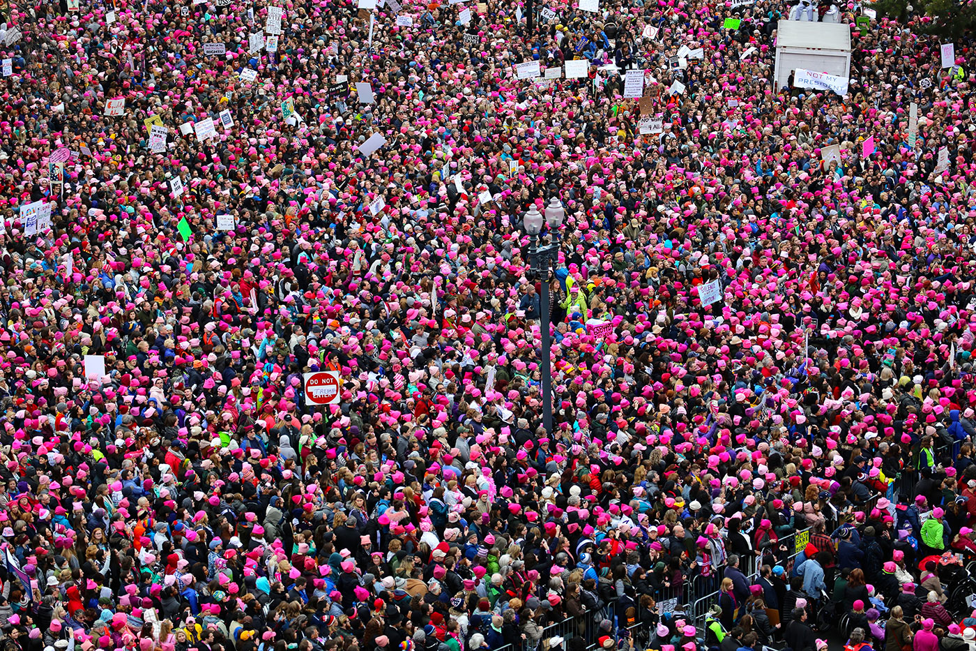
The pink, cat-eared “pussyhat” that became the icon of the Women’s March in January has been announced as the first ever “Brand of the Year” by SVA Masters in Branding Chair Debbie Millman.

In 1964, the late Marshall McLuhan coined, “The medium is the message.” He ushered in the notion that both the message and its medium influence how any communication is perceived. But in the Insta-culture of the early 21st century, it’s not as straightforward to find the cream of the crop. In an effort to understand, measure, and mark the brilliant, competitions have been created to determine the impact of brand messages.

But these competitions charge an entry fee. And they often need entrants to fill out complicated entry forms that detail and justify the return on investment, reach, and other performance indicators. So what happens to brands and products that don’t enter? They mightn’t be aware of the competitions, or they mightn’t be able to afford the often hefty entry fees, meaning potential winners are all but ignored. The Masters in Branding program at NYC’s School of Visual Arts wants to challenge these contest rules, and for the first time, the program faculty have taken a broad look at commerce and culture to identify the first Annual Brand of the Year. No entry form. No fee. In fact, no effort at all by any brand to be considered.

“We’re at a tipping point in the way brands are being created. Branding has become democratised, and the results aren’t necessarily about the commercial. The Pink Pussyhat brand wasn’t initiated for any financial benefit, but instead created by the people for the people to serve the highest purpose branding has: to bring people together for the benefit of humanity. Branding isn’t just a tool of capitalism. It has the potential to become a profound manifestation of the human spirit.”

Time Magazine pink hat cover

Time Magazine cover, February 6th, 2017.

About the Pink Pussyhat

The Pink Pussyhat was conceived by screenwriter Krista Suh and architect Jayna Zweiman. It was created to be worn at the Women’s March the day after the Presidential inauguration in Washington, DC. Kat Coyle, owner of The Little Knittery in LA, designed the pattern. The brand was launched in November 2016, and the name of the hat was an intentional response to President Trump’s recorded comments about his ability to “grab (women) by the pussy.” More than 10 million women wore handmade pink pussy hats at, or in support of, Women’s March’s worldwide on January 21, 2017.

Details via SVA’s press release.

I remember looking on in admiration at the huge numbers that marched. But since then, it’s been more a case of dejection as the Trump administration gives tax breaks to million/billionaires while the most vulnerable continue to suffer. Here’s a thought-provoking read in the New Yorker — Is there any point to protesting? — comparing the recent protests against the war in Iraq, against the finance industry after the market crash, against the killings of unarmed black people by police officers, to the much more successful protests of decades past, notably the civil-rights movement from the mid-fifties to mid-sixties. Worth five or ten minutes of your time.

Vaguely related from the archives, Debbie Millman’s interview with Milton Glaser is a great listen.

May 22, 2017

The future of branding

“...the assumption that a brand is just a look is fading, and finally people are beginning to realise that a brand is more a result.”

Read more

February 21, 2017

“The appointment of a design consultant needn’t always culminate in change.”

It’s a familiar story — there’s a change at the top of an organisation and a rebrand is one of the first things to happen.

But it’s often a backward step, where what follows is no better than what came before, while costing a fortune to implement.

“...the fact that British consultancy North has just done two major schemes for the Tate and the Co-op by either NOT changing the logo, or even reverting to an old and discarded one, is very intriguing. Perhaps the profession is finally growing up enough to recognise that the appointment of a design consultant needn’t always culminate in change.”
— Michael Johnson

Tate logo

Co-op logo

Quoted from Michael Johnson’s answers to a series of questions for Branding Roundtable No. 28, on innovating brand identity.

June 20, 2016

Six brand questions for clients to answer

“Starting in the right place and answering the right questions, rather than starting in the wrong place and offering solutions to the wrong problems.”

Read more

August 5, 2015

Giving voice to ideas

Copywriting can be about much more than just tone of voice. It can form an integral part of a company’s brand strategy.

Read more

June 24, 2014

Context is key

A valuable lesson on dealing with design clients, from Chermayeff & Geismar’s 2011 book Identify.

Read more

February 24, 2014

Brand naming resources

It’s easy to think anyone can come up with a good name, but it’s more complicated than that.

“An idea can come from anywhere, but getting buy in and seeing it through is tough. In fact, naming can be one of the hardest parts of a branding project.”

From a naming handbook by Wolff Olins. Via @gradiate.

A naming handbook

These naming specialists are listed at the end.

With a few relevant books.

Another that seems worth picking up.

Some online pieces.

And when you have your shortlist, check availability.

January 29, 2014

You (generally) get what you pay for

Tabloid stories about new designs tend to focus on two things: the money, and the logo. Here’s an example.

Irish Water (who spent €50,000,000 on consultants in 2013, but that's another story) hires Dublin-based Zero-G to create a new brand identity. The Daily Mail reports the fee as "€20,000 — €5,000 per word."

Irish Water logo by Zero-GCredit: Laura Hutton, Photocall Ireland

The Union of Students in Ireland (USI) gets wind of the story and thinks Irish Water spent too much on the design, then offers an alternative.

"We decided to use a cost effective micro-job website to pay an online seller to create a logo for Irish Water.

"This cost a reasonable $5 which was donated by a member of our staff. All we had to do was upload some brand specifications and wait seven days for our logo. It took all of ten minutes."

Irish Water logo clipart

But the alternative design (shown above) turns out to be royalty-free clipart downloaded from a stock website, which if used would inevitably lead to copyright infringement.

Water clipart

A five second Google search finds the same icon in another company logo (albeit botched).

Fair play to DIT students Emma Grattan and Derek Doyle who wrote an open letter asking the USI to stop belittling the profession they're studying to enter.

"Your response to the current debate around the value and status of the design profession in Ireland represents the kind of cheap race to the bottom that undercuts the value and worth of good design. It not only demonstrates a lack of familiarity on your part as to what is involved in the process of design but, much more alarmingly, it exposes a lack of awareness as to the breadth of courses whose students you represent."

As is often the case with tabloid stories, the focus is on two things: the money, and the logo.

And inevitably, there'll be non-designers who think identity design shouldn't cost more than a beer, there'll be publicly-funded companies who are reluctant to hire reputable designers for fear of a backlash, and we see more clipart as logos, more cases of copyright infringement.

The €20K payment to Zero-G "included complete branding for all sections of the semi-state company, not just the logo." But it's details like those that don't sell as many newspapers or get as many clicks.

November 28, 2013

The influence of colour in brand identity

Who wants 50 shades of grey when you’ve got the choice of the rainbow? Written by Laura Hussey, partner and creative director at London-based SomeOne.

It’s drizzly, it’s grey, everyone is wearing black and I’m a Celebrity is back on the telly tempting me with the lush green Australian rainforest and it’s vast, bright blue skies. I’m sick of the dullness of winter. I need some colour.

Union Jewellery boxesUnion Jewellery packaging by Red Design

My desire for colour isn’t only at this time of year either, I crave it all year round — in fact I’d go so far as to say I draw energy from it.

Brands can benefit from our desire for colour, too. It can help keep conversations intriguing, energetic and rewarding.

A study of the world’s top 100 brands (defined by brand value) saw 95% use only one or two colours. 33% of those top brands would like to think they own the colour blue, and 29% think red is their colour. It suddenly becomes irrelevant, it’s what you do with it that counts. Why be limited?

Take a look at how Oxfam have rebranded with a reinvigorated palette of colours and the mantra ‘provocative optimism’. The charity has to deal with famine and world disasters and yet still has to attract people to be inspired to give money. The most immediate way to do this is through their brand colours. The vibrant colours help to reinforce Oxfam’s positive attitude towards fundraising and boost their rallying cry, making people feel positive about taking part and able to help affect change.

Oxfam identity by Wolff Olins

Another brand that recognises the power of colour is The Guardian, whose use of a spectrum of colours to illustrate it’s all-encompassing news. Multiple colours speak of choice, variety and diversity. Think Google, NBC, eBay, or MSN to name but a few that use more than two colours to express their breadth.

Google data center pipesGoogle data center pipes

We chose a similar approach when we created the Brand World for The Halcyon — an exciting development highlighting the best of British art, retail, design, music, exhibitions, gallery and food. The colours used within the brand and environment were derived from, and act as a subtle nod towards the diverse colour palette used during Britain’s great creative periods of the past — our Halcyon days, mixed with those we see around us today.

The Halcyon identity by SomeOne

Colours can reflect the emotional outlook of a culture and so it’s no coincidence that as we emerge from the UK’s longest, deepest postwar recession we see a change in colour trends. We want to feel happy and secure, and that’s why we gravitate towards colours that bring about more positive emotions. Think of the striking pink Olympic signage that directed people around London and how happy and talkative people in the city suddenly seemed to be. Even many normally surly locals engaged in casual conversation. The colour got a good showing on many volunteers, too. Why? it stands out, it’s appealing. The result? A capital city and thousands of people adorned with a surprisingly bright and appealing shade.

London Olympics signageImage: Surface Architects

The Dutch artists Haas & Hahn saw this potential when they lived and worked in some of the world’s most violent places. It is unusual to have to ask permission of a drug lord before you can start painting, but in Vila Cruzeiro – generally considered one of Rio’s most dangerous favelas – this is what they had to do. Not just to beautify, but also to create a dialogue with their surroundings. After several successful projects, the image of a square painted in a design of radiating colours yielded worldwide fame and transformed Rio into ‘one of the world’s 10 most colourful places’. It stands out.

Favela painting by Haas & Hahn

Colour doesn’t just benefit worthy causes though — you only need to look at Jonathan Ive’s colour choices for the new iOS 7, or the sweet shop choice of iPhone 5C. More than any iPhone in history, the iPhone 5C is all about colour and personality. Some say Ive was inspired by the well-regarded graphic designer of the late 20th century, Mitsuo Katsui whose designs are known for vibrant use of colours in motion, often placed within wide, single-colour blank spaces. Katsui’s abstract forms also often use transparencies to highlight contrast effects.

iPhone 5C coloursPhoto via iPhone Hacks

Similarly, for the launch of Tesco’s first tablet – the Hudl, we wanted to inject warmth into a category that can often be overly technical and unfriendly.

Hudl colours

‘Be more Colourful’ doesn’t have to simply mean ‘use lots of bright colours’ either. A brand can behave more colourfully through their actions, their tone of voice or their inventions. Innocent Drinks has grown from a three-person outfit to a multimillion pound business, a large part of the company’s success can be attributed to the brand’s tone of voice. It has managed to stand out in a saturated drinks market by being friendly and engaging, sometimes even cheeky but always distinctive. It has managed to elevate the brand way above it’s competitors.

Innocent Drinks colours

Then you have Marmite — a yeast-based spread. Nothing very sexy or colourful about that and yet by being brave enough to recognise their product is hated as much as it is loved it has elevated it to much more than a savoury spread. It’s ‘Love/Hate’ campaign has earned them many fans and its originality means it’s now used to mean anything which strongly divides opinion. The strength of the brand means it can now expand into other areas, even fashion — ‘Love Marmite, Hate Jams’ as seen on many a trendy fixie rider weaving through traffic.

Love Marmite, Hate JamsRoad cycling jersey available from Foska.com

Brands want fame and monopoly and to do that they must stand out and appeal to human beings, so they need to be more optimistic – more colourful. Who wants 50 shades of grey when you’ve got the choice of the rainbow?

---
Laura Hussey is partner and creative director at SomeOne in London.

January 4, 2013

Defining iconic brands

Computer Arts editor Nick Carson asked me to name three contemporary, iconic brands. Nick also asked what I think defines an iconic brand, if this has changed in recent times compared to classic brands of previous decades, and if a brand can be iconic without a great logo.

My three picks: Google, Subway, IKEA.

IKEA pictogramsImage via Jiho Park

The definition of an iconic brand

It should offer the "go to" product or service within its market, delivering what people think of first when they want what the brand sells. So if I'm looking for something online, I think of Google. If I want a quick sandwich made with care, I think of Subway. If I want to furnish a house without spending a fortune, then there's IKEA.

Competing today is different from the past because where customers once had just a handful of brands from which to choose, they'll now have hundreds, maybe thousands. To stay at the top, brands need to relate to their customers in ways that are more than just an exchange of money and products. A small part of the relationship can be as simple as the free tea and coffee IKEA gives family card holders, or as life-changing as the $50M+ that Google employees donated to more than 12,000 non-profit organisations.

Can a brand be iconic if it doesn't have a great logo?

I don't think Google, Subway, or IKEA have great logos. Some people might think they're great simply because of the product or service that backs up the brand, and ultimately, that's what it's all about — the product or service.

But the visual identity plays its part, and most successfully when different elements interact. Google, for instance, paints thousands of feet of pipework in its data centres with the various colours used in the logo. But not just because it looks fun or cohesive. Each colour designates a different section of pipeline, so engineers know where they go and what purpose they serve.

Google data center pipes
The blue pipes supply cold water and the red pipes return warm water back to be cooled.

---
My answers were a part of Creative Bloq's post on 20 iconic brands, along with contributions from Ben Marshall (Landor), Michael Johnson (johnson banks), Paula Benson (Form), Geoff Philips (MetaDesign), Andra Oprisan (Saffron), and Kieren Thorpe (BrandOpus).

Related, from the archives: Remove the logo. Know the brand.

October 25, 2012

The ideal design process?

I watched a good CreativeMornings video where Tom Foulkes and Michael Johnson talk process. Michael included this flowchart overview of his brand identity design process.

Design process flowchart

“Meet, talk a lot, summary, talk a lot more, verbal brand, then write up a brief, do quite a lot of work, then present.”

During his (nearly) 20 years in business Michael has very rarely been in the situation where he presented just one idea and it was signed off by the client. This is one of those few designs where it did happen.

Shelter logo

“Sitting in the presentation I had the board one way round, turned it over as said, ‘What do you think?’ and they all said, ‘Yeah, it's great.’”

Here's a much more common presentation approach.

Design process flowchart

The best three options are presented (one safe, one adventurous, one scary — from a client perspective), a direction is chosen, developed, then signed off.

One of the best pieces of advice Michael has been given, before he started his own business, was to take the scary option and make it even scarier. That way, the original scary option suddenly seems safer, and more likely to be chosen. It's those riskier, more polarising options that are often the most successful.

I've embedded the presentation below. Or you can watch it on Vimeo.

Worth your time.

Filmed and edited by Nick Culley.

---
Update:
A more in-depth writeup is on the johnson banks thought for the week.

June 5, 2012

Shape as a brand attribute

When a brand's product is obvious from the shape alone.

Read more

April 23, 2012

Using sound symbolism in branding

Take two imaginary names, Maluma and Takete, and before reading any further, pair each name with one of the two symbols below, the one you think is a better fit.

Read more

April 13, 2012

What convicts can teach us about branding

Written by Mike Kammerling of Tinder + Sparks, about Neil Stansfield who was jailed for more than two years for buying own-brand supermarket food, repackaging it as organic produce, and selling it on at a huge markup.

Raw salmon filletPhoto via Thinkstock.

In September 2009, Neil Stansfield of Northamptonshire was jailed for over two years for buying own-brand, non-organic supermarket food, repackaging it as well-sourced organic produce and selling it on at a huge markup to highly reputable food retailers.

On the one hand what he did was a shameful act of manipulation that undermined an already beleaguered organic market and the honest work of a lot of passionate food producers. On the other hand it was a hilarious example of how branding can increase the perceived value of a product.

For five years Stansfield and his staff of twelve were purchasing pork pies, smoked salmon and much more from the likes of Tesco and Aldi, stripping the outers, and re-wrapping them in their Swaddles Organic branded packaging. In doing so Stansfield not only made a name for himself as a highly regarded organic food supplier, but also managed to sell his products to discerning retailers like Fortnum and Mason, a coup of which he boasted to the local paper.

"Fortnum and Mason searched for the finest British classic pie throughout the UK and after arduous searching they came upon ONEfood and Swaddles, sampled the product and found it to be the best in the UK."
— Neil Stansfield

He called Swaddles’ parent company ONEfood — where the ONE stood for Organic, Natural and Ethical — and recorded annual sales of between £500,000 and £2.5 million.

Swaddles packaging design

Above are some examples of the packaging taken from the website of ONEfood’s design agency. The fact is, it’s good design and ticks all the boxes required of a mass distributor of organic produce. We have the wonky, cursive script, a colourful palette and some emotive photography. And above the main logo — like a cherry on the cake of bullshit — is the Soil Association logo, a stamp that certifies produce as organic.

After this controversy emerged, the design agency must have wondered whether to keep the designs on their portfolio. But why not? They did a fantastic job, demonstrated by the huge success of the Swaddles Organic range.

Swaddles packaging design

The fact is, if anyone was going to enact a mass swindle in food packaging, Neil Stansfield knew exactly how: by spending money in the right place to ensure that the packaging gets in front of the right audience, and is trusted when it does.

As any branding consultant or designer worth their salt knows, the perceived value of a product is what makes it sell. As David himself mentions in Logo Design Love, the Skoda is consistently voted ‘Car of the Year,’ delivering excellent mileage and value for money at a fraction of the cost of, say, an Aston Martin. And yet people are willing to pay well over the odds for an Aston Martin; for the prestige, literally for the ‘badge value.’

Aston Martin badgePhoto credit: carpictures1.com

But packaging can have an even more profound effect than just making us believe we are paying the right price for a product. In his book Blink, Malcolm Gladwell reports a fascinating case about 7UP. In the 90s the company changed the can design very marginally, adding more yellow onto their label. This proved to be a bad move. People were up in arms, claiming that the company had made 7up more "lemony" despite the fact that the drink inside hadn’t changed at all. People wrote in to complain that 7UP had done a "new Coke." There are countless examples of this kind of activity showing that a label affects not only the price people are willing to pay for a product, but can also psychologically impact upon the taste.

Perhaps this is how, once upon a time, Fortnum and Masons came to believe a Tesco pork pie to be "...the best in the UK."

In the end Neil Stansfield was arrested when, following a tip off, the Food Standards Agency bought a salmon from Swaddles (at £51) and discovered it to be neither wild nor organic as it claimed on the label but in fact bought from Waitrose the previous day (at £20). He was sent down for 27 months and his wife and business partner were given compulsory community service for their part in the scam.

What they did was terrible, dishonest and wonderfully entertaining. But what it teaches us is the incomparable value of good branding and design.

---
Mike Kammerling is creative director at London-based Tinder + Sparks.

Reported in The Telegraph (2009): Organic food company guilty of selling non-organic food.

December 27, 2011

Penguin, in Champions of Design

Excerpted from Champions of Design, the paperback by Silas Amos of Jones Knowles Ritchie, featuring on one of the 25 brands from the book.

Old Penguin logo

Given its beloved status as a British institution to rival the BBC, it's worth remembering what a revolutionary idea Penguin originally was. The company's cheap but well-made, well-designed books found a new audience of working and middle-class readers that few believed existed. The future really was orange.

If the point of a brand mark is to guarantee quality, then Penguin excels. My father, a lifelong devotee, describes it as 'my university'. Many share his trust and appreciation. Like holding a Guinness at the bar, one feels part of a select band when reading a Penguin on the Tube or beach. Generations of investment in great design has helped earn this status.

Penguin book covers stripesPhoto via James Muspratt

The original (Tube map inspired?) system of distinctive coloured stripes met the business strategy; they would have been cheap to produce, compared with myriad cover designs and illustrations. However, we don't want cheap brands. We want great brands cheap. Penguin used good paper, quality binding and typography that allowed the words to breathe. They were designs of hardback quality in soft covers.

This flightless bird has adapted beautifully over the years, radically changing its design approach in response to market forces and trends, from the graphical covers of the 60s, to the commercial designs of today. Penguin achieved coherent change mostly from having a strong in-house design culture. This ethos was not elitist. Edward Young was a 21-year-old office junior when he drew the logo and devised the colour-coding system. A secretary came up with the name.

Luck also plays a part in great brand design. Penguin was still young as World War II erupted, and its format just so happened to prove the perfect fit for a battledress pocket. On such quirks are great brands built.

---
Did you know, in 1989, following Penguin's publication of Salman Rushdie's The Satanic Verses, bombs were planted in a Penguin bookshop in York and in Liberty's in London where the company also had a concession?

Champions of Design

Available from jkr.

Somewhat related:
Penguin logo evolution.

David Airey
Brand identity design

Independent since 2005
Website hosted by Fused
FAQ
Resources
Process

Studio
64 Beechfield Avenue
Bangor, County Down
Northern Ireland
BT19 7ZZ

studio@davidairey.com
07739530457
LinkedIn
Twitter
Substack