2014 Branding Trends –
Rad, Bad, And The Next Fad
A brand’s design is all about first impressions. If done well, the execution of a brand can seem almost effortless and subtly communicate the core company values. This subtle emotional hook is what makes beautiful branding sing. When done incorrectly a customer is confused or turned off before you even have a chance to say “hello”.
Like all design, branding trends come and go. So, what is rad, bad, and the next fad for branding in 2014? Let’s take a look!
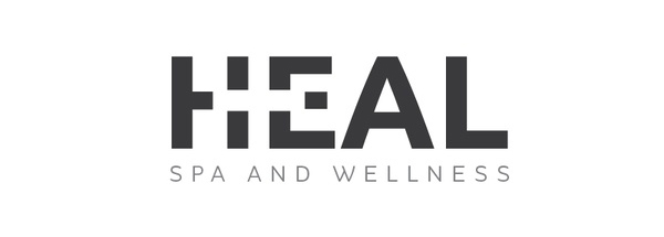
Simplification
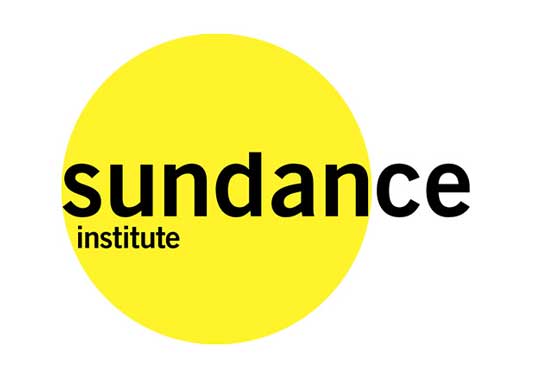
Less is better. With a simple logo design, a brand’s core message is communicated more effectively, leaving behind all the embellishments and noise. This branding trend is popular among education, law firms, universities, and any subject matter that is often complicated to consumers. Flat, streamlined, and honest is the hottest trend in branding today.


![]()
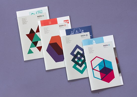
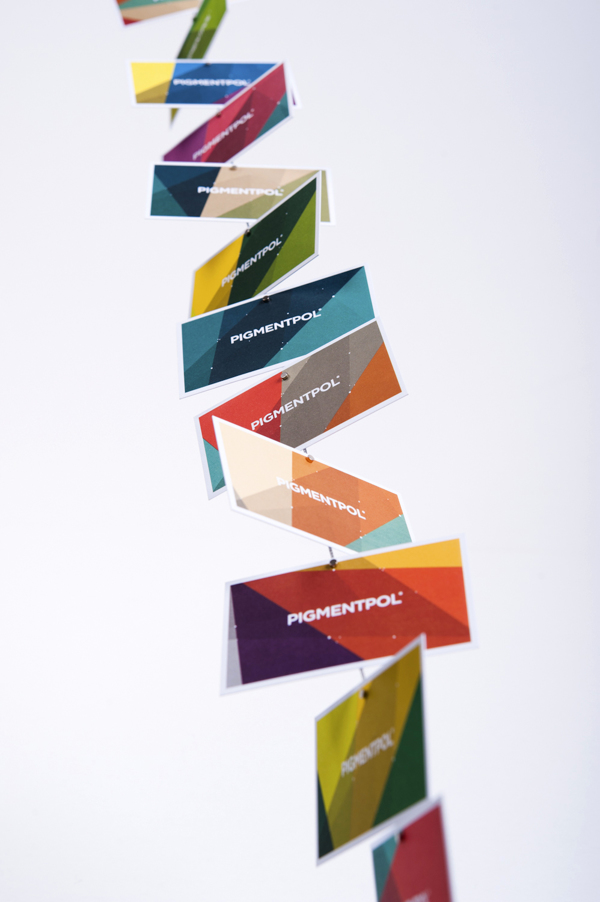
Geometric Design
Inspired by the design era of art deco, geometric designs are popular in modern brands. The geometric trend allows brands to have fun with color and design elements, but keep the overall design concept simple.
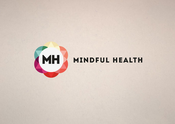
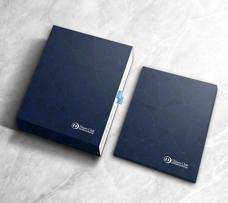
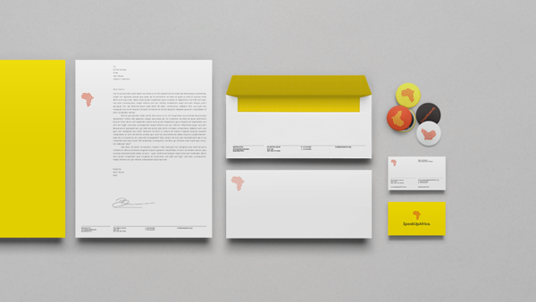
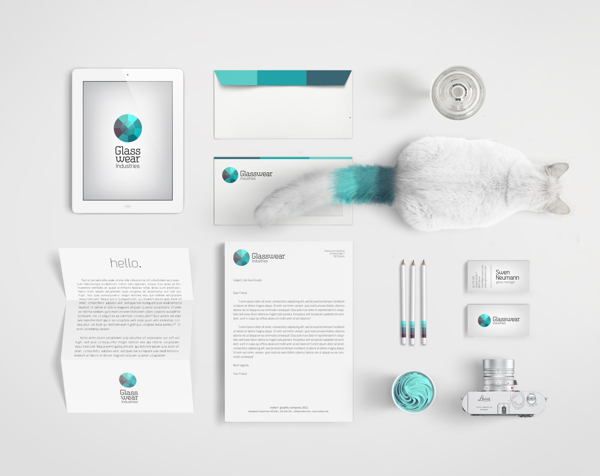
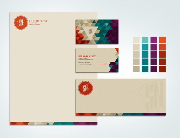
Mosaic Patterns
The mosaic trend in brand and identity design can stand for so many different things. For many brands, it can typify room for growth, innovation, and even multicultural values.
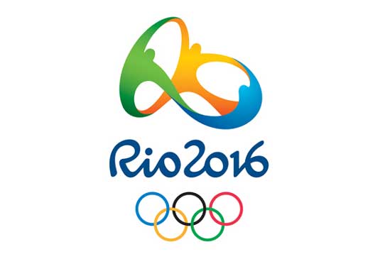
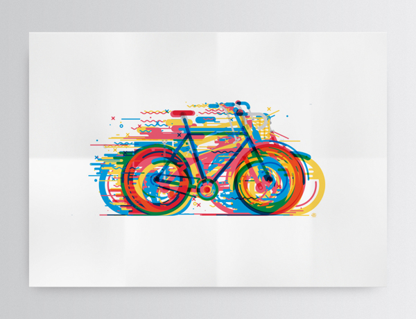
Energy and Motion
Designs that portray energy and motion are popular among tech firms, music/label companies, athletic brands, and the electrical industry. Designs that define energy and movement has the ability ignite emotion. It can even communicate the idea of constantly moving or making a significant change to something.

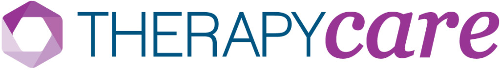
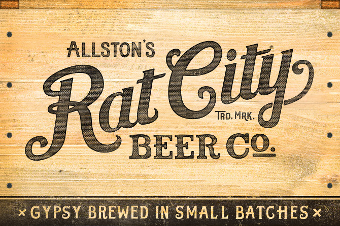
Retro/Script Type
Brands that use retro or script type communicate history or long term commitment. A brand that’s here to stay or has been making a big change or impact either in their communities or even the world can use script type to express these values. These brands have a tongue in cheek style that shows class with a touch of whimsy.
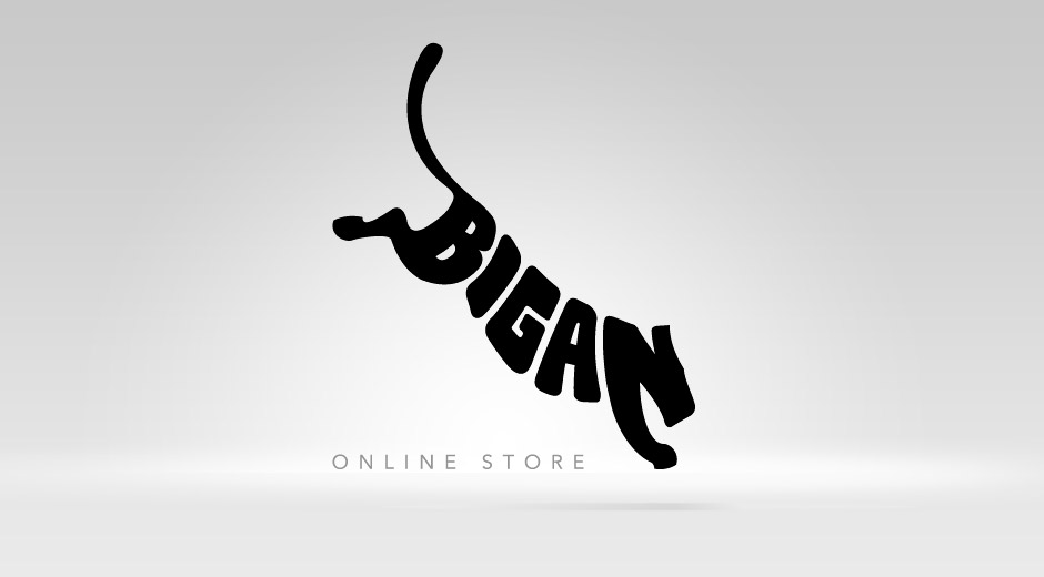
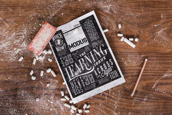
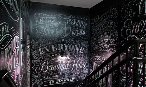
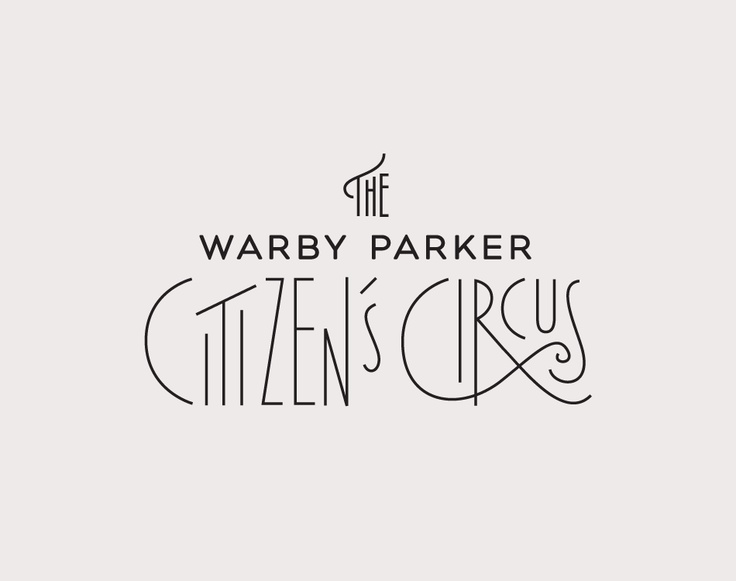
Custom Typography
Custom typography allows a brand to stand out from their competitors. It expresses innovation and a strong belief that thinking outside the box is the key to success. Brands that use custom typography also give themselves freedom to build a unique brand around this fresh design element or custom script.
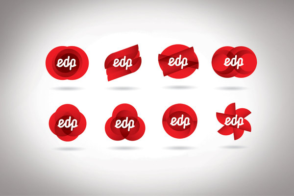
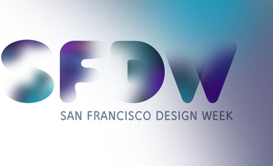
Transparent Overlays
Transparency overlays and opacity can transform a logo to look more modern. A few years ago, Designer, Turner Duckworth, redesigned Tassimo’s logo. As you can see, the logo design with the gold type and background (on the left) looks outdated and stale. The new design done in 2011 (on the right) has a multi-color palette that expresses the different options Tassimo’s brand has to offer.
![]()
![]()
Below are more examples on how to use overlay and transparency in design:
![]()
Metallics or Unsubtle Gradients
Designs that use metallics can come off looking inexpensive. Metallics, or unsubtle gradients in general, can also outdate a brand, even if the brand was recently founded.
![]()
![]()
![]()
![]()
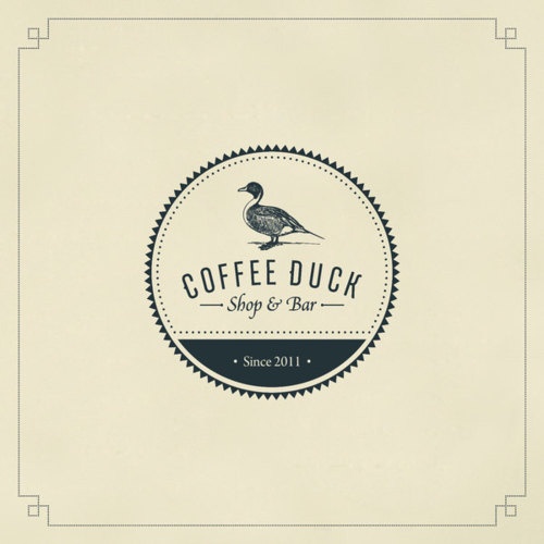
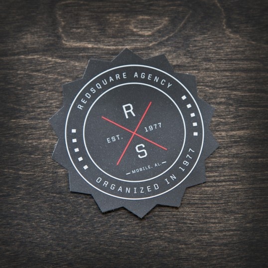
Badges and Buttons
Badges and buttons in brand design are just simply overused. It’s been done over and over again. It’s not that the design concept is bad, but it’s nothing new. Brands that use badges and buttons in their design face the issue of being too similar to other brands.
Too Universal
Branding is a fine line between showing you understand a trend and setting the next one. But when your mark is too basic it can create confusion amongst your customers. The worst path is to create a mark so simple it could apply to any brand or feels unfinished in its execution.
![]()
![]()
![]()
Bevel, Embossing, & 3D
Bevel and emboss either screams 90’s or looks comically retro. At its worst it becomes 3D Flat is in and brands that use bevel and emboss give the impression that they don’t know much about today’s aesthetic.
![]()
![]()
![]()
![]()
Selective Focus
Not every logo design has to be in focus. Selective focus in identity design holds the viewer’s attention, causing a second look. A subtle disappearing act in the background can be entertaining and fun.
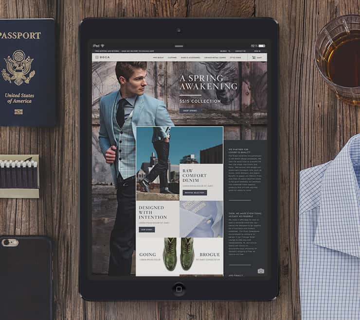
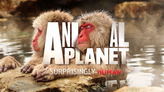
Images as Brand
Photography is slowly finding its way into branding. Inspired by Google’s shapeshifting illustrations, the use of photography as a design element is a new frontier. The challenge, and benefit, is the always fresh look available in such an open concept.
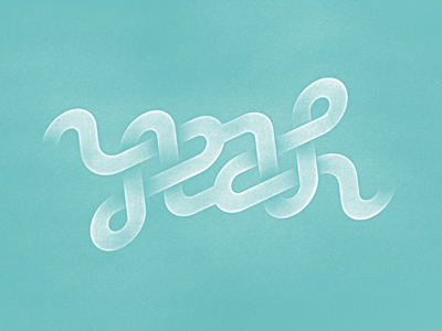
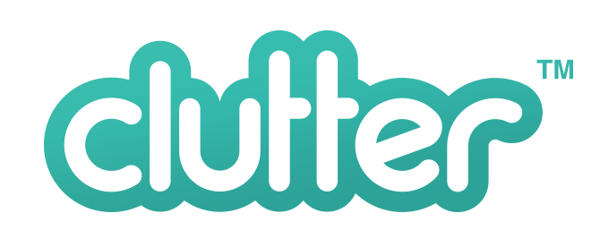
Rounded Typography
Rounded typography can be playful, modern, and even elegant. A brand has endless options when using rounded type.
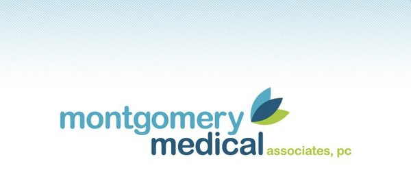
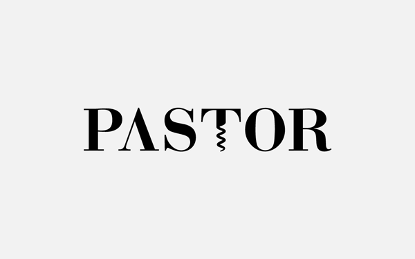
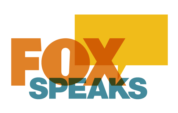
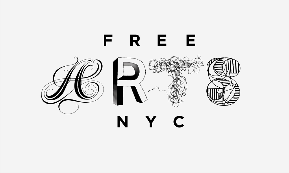
Multi-Font
Mixing fonts in a brand’s logo can help separate two ideas. This design concept is popular for brand’s that have a name that cleverly expresses two parts of their brand’s message. This trend can also help avoid conflict when a brand fears confusion in their brand’s name or message.

![]()
About the Author: Shannon Callarman is the Marketing Coordinator at Cubicle Ninjas. She’s the tiny ninja behind the CN Twitter. You can also follow her on Google+.